Amazon Fire TV - Core UI
Redesign the entire core UI of Fire TV to help with key customer journeys like discovery and search.
My RoleContributor
CompanyAmazon
PlatformFireOS
ScopeIA & Voice CX
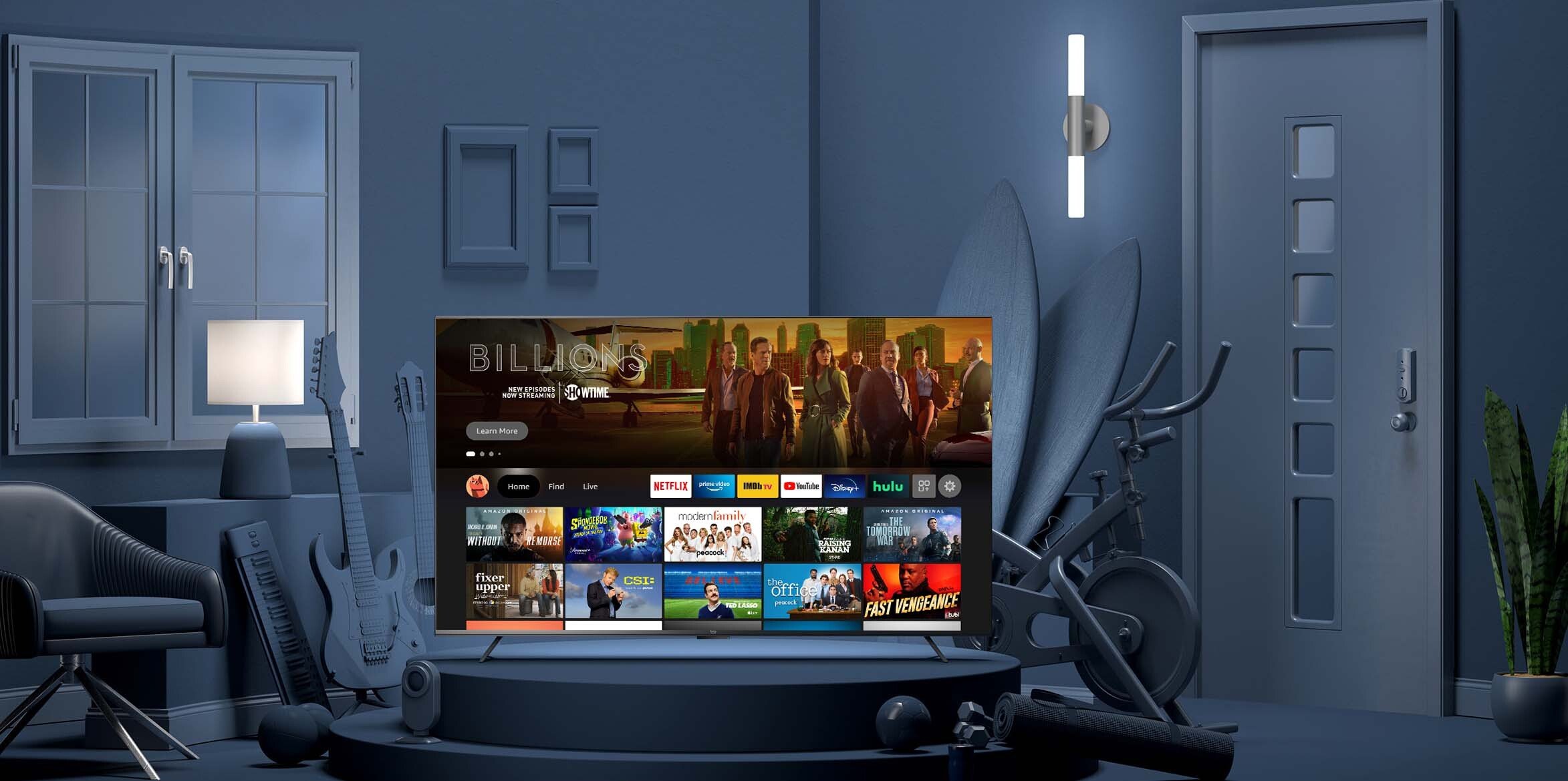
IA & Navigation
Content type vs Intent. Our information architecture had been built on differentiating content type (Movies, TV shows, apps, etc) since the beginning. While this is the most intuitive approach, it doesn’t scale well for a UI: you eventually run out of space as more content types are added to the product. We’ve seen a steady growth of content types we offer on Fire TV thought out the years. As we added our 7th tab on the main navigation bar, we realized something has to be done.
The 2020 UI redesign focuses on evolving our IA to be more scalable. We dug into years of generative research data that our research team collected and decided to focus on an IA design that starts with customer intent, then breaks down to the traditional content type based structure.
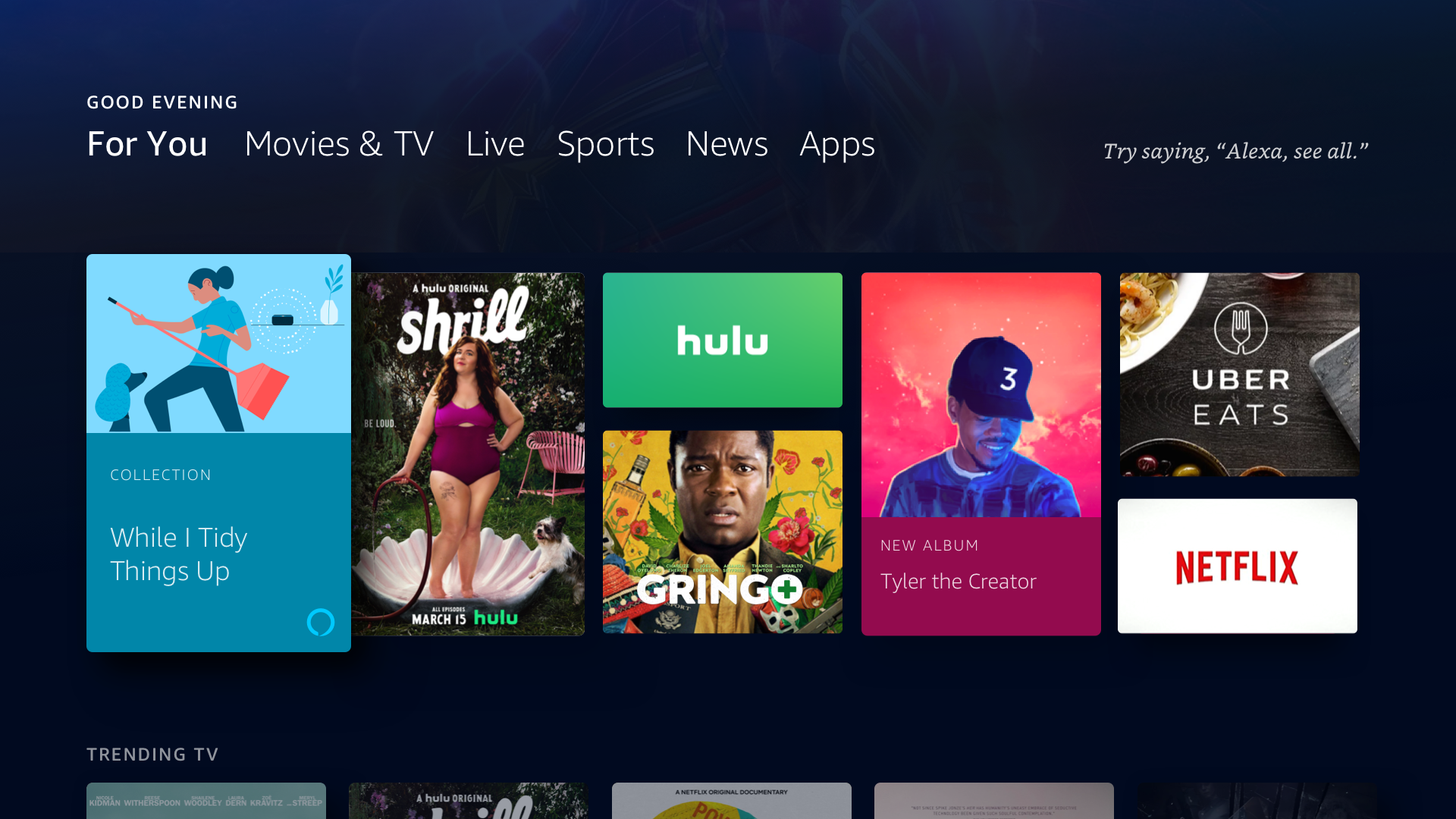
In the previous user interface, we implemented content type-based navigation to assist customers in refining their searches. However, customer feedback indicated that all tabs appeared similar, leading to reluctance in switching between them. Consequently, the majority of customers remained in the Home tab and all teams started to stuff content in the same tab, hoping customer will engage. The new user interface addresses this issue by reducing the number of tabs and organizing them according to customer intent. This includes a Home tab for continuing watching and personalized recommendations, a Find tab specifically designed for focused searches, a Live tab for electronic program guides (EPG) and patterns tailored for linear television, a Free tab dedicated to entitled content, and a My Stuff tab for saved items across the experience.
Navigation bar. The new intent based layer in our IA enabled us to build a much smaller top nav bar, giving us space to include 6 top used apps in the same nav bar, giving customer easier access to their apps. The added benefit of pulling up apps is that we can treat them as both button and tab. When focus is placed on an app, we can use the space below to uplevel content from that particular app, further saving customer time to get back to a movie or check out what trending.
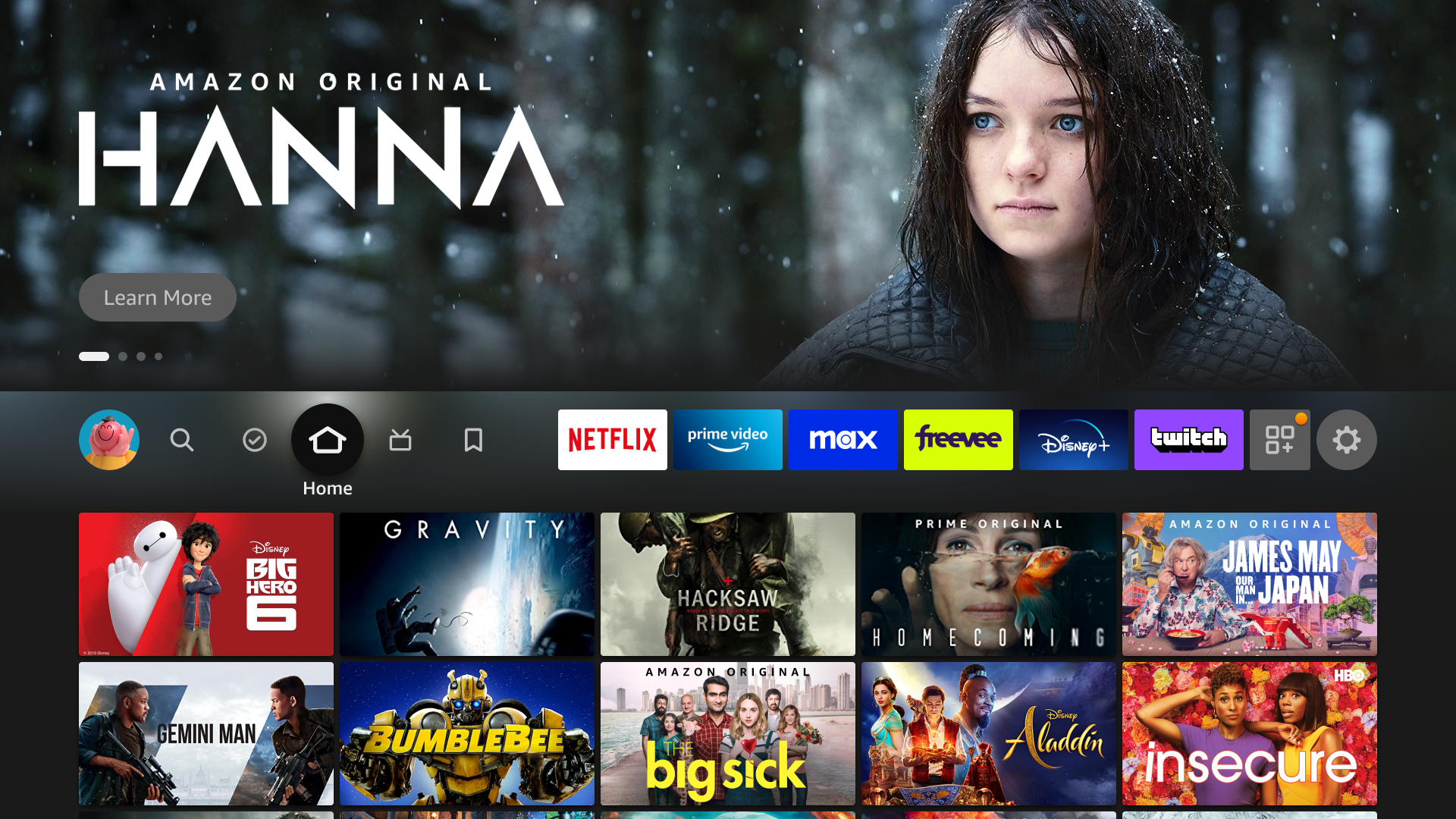
Home tab
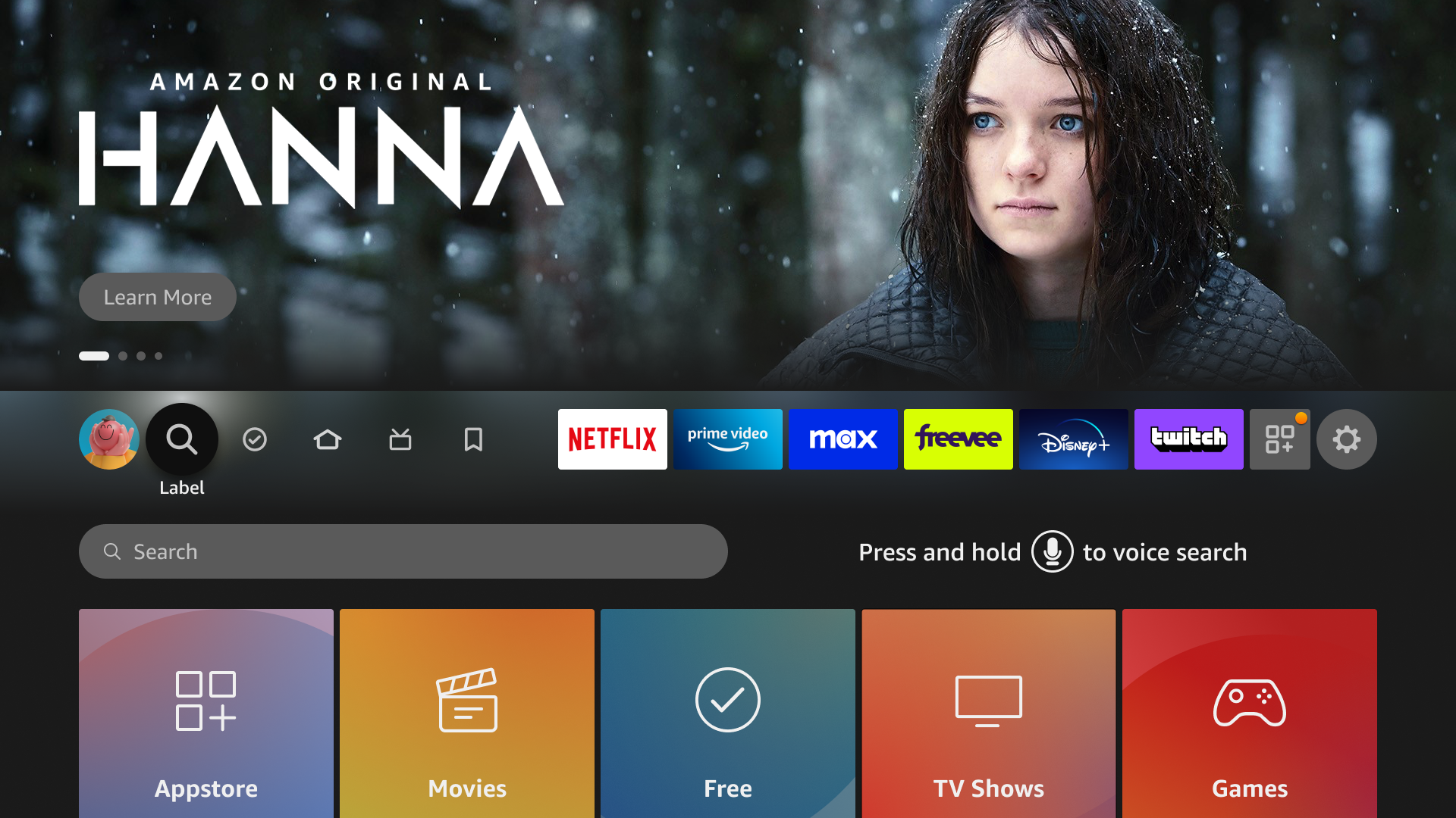
Find/Search tab
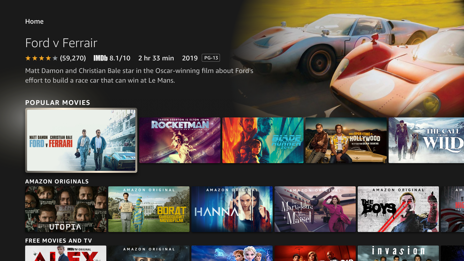
Standard Browse Page

Detail Page
Browse Pattern
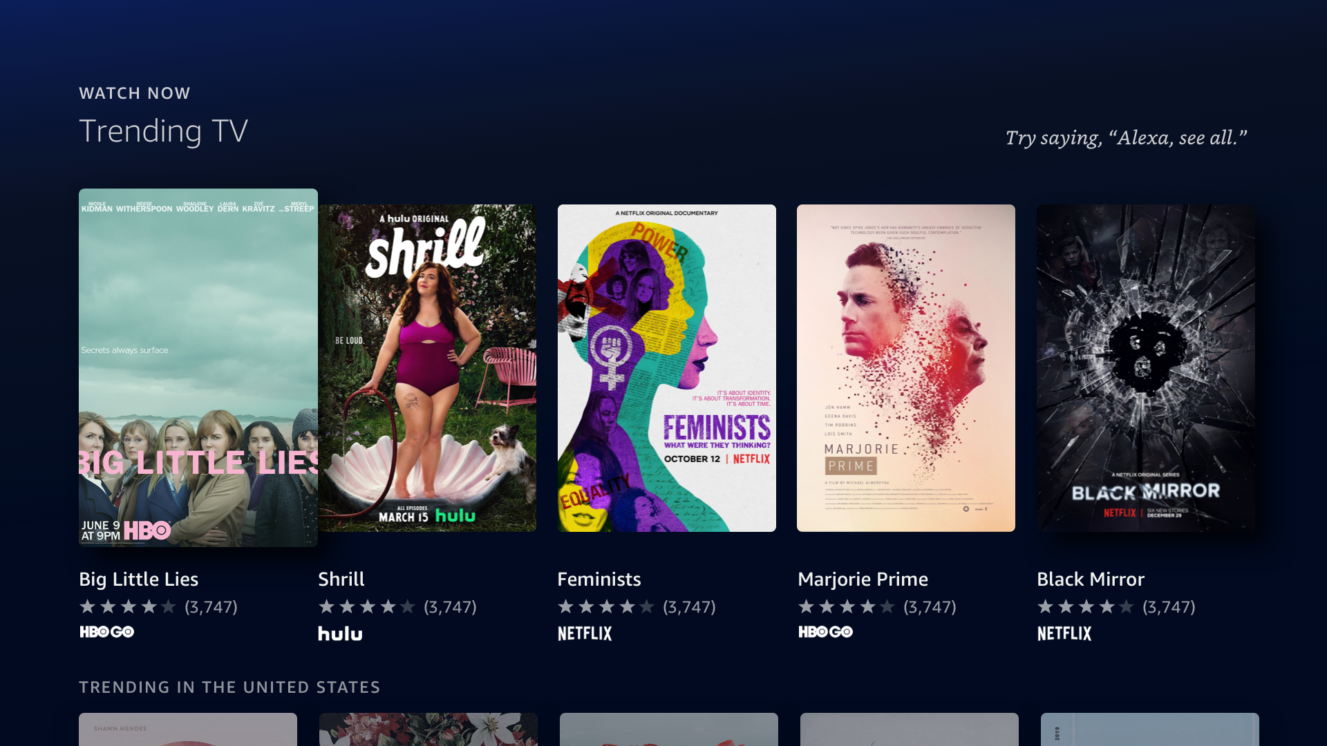
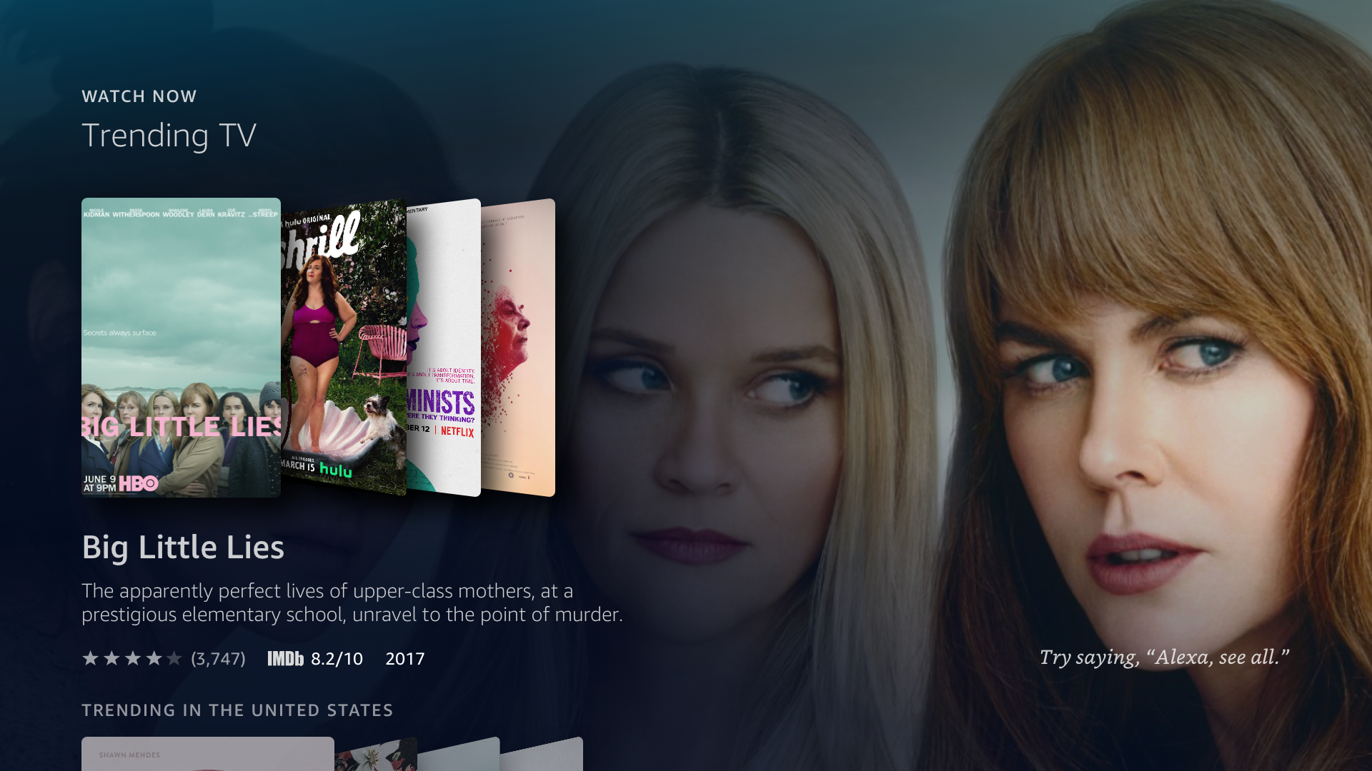
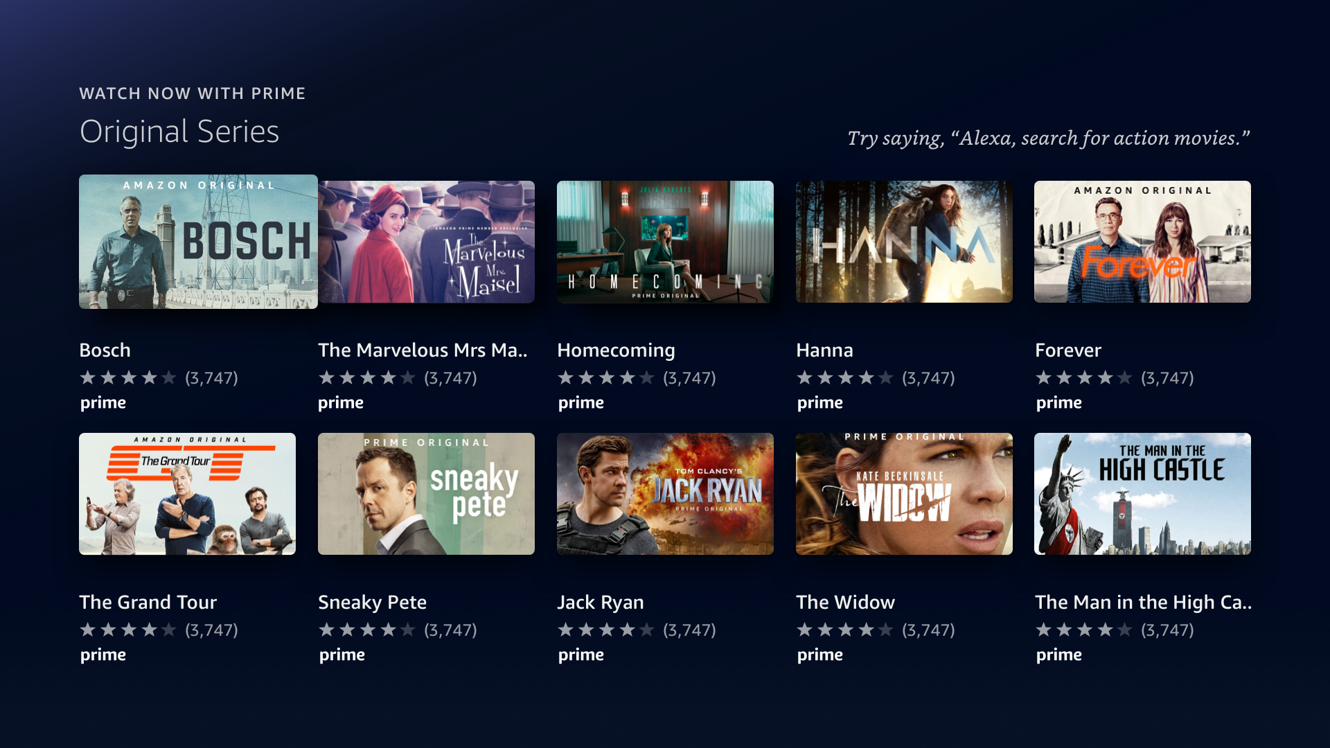
We also wanted to diversify browse patterns that are available to customer to further address the “every tab looks the same” problem. While improved IA encourages horizontal movement across tabs, a diverse browse pattern encourages customer to move vertically down a tab and explore even further. The team started tackle this problem from 2 angles:
Content strategy: Form follows function. Browse patterns are designed to support different discovery needs. A main dial we used was content density: more immersive (low density) layout for high confidence recommendations and less immersive (high density) layout for broad and generic recommendations.
Multi-modal support: every browse pattern we come up should support interactions in multiple modalities. I will get into more details on this in the next section.
Voice CX
With the Fire TV Cube, customers can use voice commands to interact with Fire TV, but they still need the remote for some actions. For example, you can ask Alexa for comedies but must still use the remote to select from the results. This limitation reduces the effectiveness of voice commands. Ideally, you could enter the room, ask Alexa for comedies, browse choices, and play one—entirely using your voice.
I led the creation of a set of new browse patterns that work well across all Fire TV modalities: remote, touch, and voice. I established two main principles for designing a seamless multi-modal experience:
Fluid Transition: Users can switch between different modalities (voice, remote, touch) easily without losing context, as our research data shows that people often don't stick to one modality while completing tasks.
Use Voice for Simple Actions: While voice commands are helpful, using them for small, discrete movements (like “go right” or “go left”) is less efficient than remote click or touch gestures. Voice should be used for larger actions that move further across the interface, therefore reducing the need to repeat navigation commands.
The outcome was a set of rules to guide the movement of various components to change based on the input modality. Take a look at at videos below to get a sense of how the system works.
Transition from remote to voice.
Voice navigation